We’re a bit of a data agency
Data itself does not equal information, let alone relevant information. So, how to find and collect the right data? How to process, clean and wrangle raw data so that it becomes valuable to you? And how to analyze, visualize and present it all? These are the questions we are most excited to help you with.
What we do
Our services usually fall in one or more of the following categories.
Data Research
We have extensive experience in finding datasets that can help you tell your story.
Processing & Enhancing
Unfortunately, datasets are often a mess. We can help with processing, cleaning and enhancing raw data.
Analysis and Presentation
We can analyze your data for patterns and outliers, and present our findings with beautiful visualizations.
Work
Some of our finest.
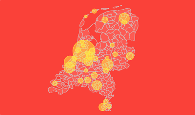
Cultuurmonitor.nl (Boekman)
We helped Boekman with collecting, analyzing and visualizing data on their new annual Cultuurmonitor. The Boekman Foundation collects and disseminates knowledge and information about the arts and culture in both policy and practice.
Internal Dashboard (unnamed client)
This client had a large collection of complex, interconnected data. We made a bespoke dashboard with connected maps and charts to prove valuable insight into the data. We used Svelte and D3 for this, a perfect combination.

International Rescue Committee
Project Dandelion is a product by the IRS designed from the ground up to prepare primary-school aged refugee children for greater cognitive, social, emotional and academic success.
We help the team with visualizing and interpreting the results of their surveys.

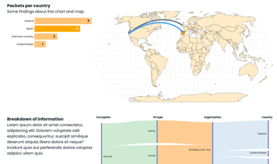
Copyright gone wrong
COMMUNIA advocates for policies that expand the public domain and increase access to and reuse of culture and knowledge. We helped them with visualizing amendments made in the European Parliament that pertain to copyright. The resulting Sankeys can be easily shared in any configuration that make sense.
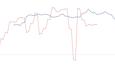
Some notes on predicting the future
Twice a year, the IMF evaluates the state of the world economy and presents forecasts of future economic growth, leading to news headlines such as this one and this one. The nice thing about specific predictions for the future is that, once that future has arrived, you can have another hard look at those predictions and learn how much, or little, sense they made.
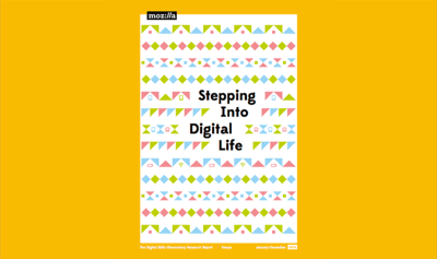
Mozilla – Digital Skills Observatory
We helped the Digital Skills Observatory team to analyze their research data on first time smartphone users in Kenya. We coded the answers to 6 interviews, and built dashboards that proved essential for the teams data analysis and vital for sharing their work with shareholders.
Mozilla – Internet Health Report
The Internet Health Report is Mozilla’s new open source initiative to document and explain what’s happening to the health of the Internet. We helped the team to gather, combine, analyze and visualize data around key topics on global internet health, and contributed to many findings in the report. All visualizations in the report are built with help from our research and analysis.
About us
After gathering years of experience at data platform Silk.co by helping 100+ companies, NGO’s and journalists make sense of their data, we formed a bit of a data agency. Coming to you live from gallery Schatjes in Amsterdam.

Caspar Egas
Caspar has a background in International Development studies and interned as a policy analyst before becoming a data-driven storyteller at Silk. Here he helped numerous companies, NGOs and journalists to make sense of their data, and created many data stories on his own accord.
Caspar is well versed in social research methods, never loses sight of the big picture and has been nicknamed ‘the data wizard of Amsterdam’ on several, very nerdy occasions.

Jurian Baas
With a background in Digital Design and Political Science, Jurian always has had an interest in explaining tough subjects visually. After setting up the marketing and community strategy of design startup Usabilla, Jurian was head of community at Silk.co, helping users with all their data needs and wants.
Jurian has a knack for data programming and a need for creating beautiful and informative visualizations, and he loves to help people find and solve problems they didn’t realize they had.
Contact us
Do you want to work together, or do you have an interesting idea? Do tell! Please use hello@abitofdata.co or the form below.